Tuesday, 29 November 2011

Bleaching and scratching on film, oh my!

Today was fun.


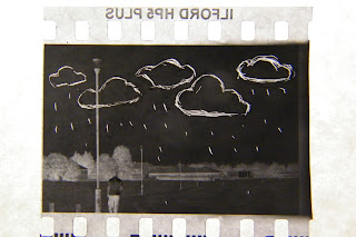
I got to experiment with illustrating directly onto 35mm film! It certainly wasn't the easiest of tasks, but it was fun. I mostly used a craft knife to carve into the film, but did have a try at bleaching (#2)
I'm looking forward to experimenting more with this, and creating some interesting effects!
Algebraic!

Monday, 28 November 2011

Holy multiple posts, Batman!

Aye, sorry about all the posts, but I honestly just got so excited about what I just did I couldn't hold it any longer. Also, it might be able to help someone.  Just sayin'.
So I was creating my walk cycle, and realised I couldn't do anything without a light box. Absolutely nothing. After turning the house upside down looking for something to use, remembered I had one of those 'under the bed' storage boxes from B&Q. you know, the see through ones....


 So I suck a light inside and propped it up. Turned the light on, put on the lid, and Bobs your auntie.
It's not perfect, and I'll probably need to buy a proper one in the future, but it works.
Simple things, eh?

So much Blue!

Possibly just stumbled across the technique I'm going to use to fill my characters...
textures!
 Super simple, yet probably better than anything I could do using digital colouring.
Also, I suck using the pen tool. Should probably practice more.

I dun werk - A quick recap on last week's work.

So early last week I redesigned my characters. Well, not so much redesigned, as re-jigged? I wasn't happy with some aspects of my male robot, but kept him very similar to my first design. I feel he is now better proportioned, and the details on his body could give an intersting effect when animated. Not looking forward to animating his arms. Providing I dont make them too bendy (originally spelled this bandy? I'm not sure which one I want to use now.....) I should be alright though.
Quick sketch of my male character

My female character was different. I disliked her design greatly. i could have tolerated her, but I wouldn't have been happy animating with her at all. I hated her shape, and her simplicity. 
I wanted a stark difference in the design of my mains, the male being 'square' and blocky (like the basic shape of most male characters) while I wanted my female to be curvy, more organic. This was not the case in my previous design, so I scrapped her and started again. MUCH happier with how she looks now.

 Rough charater sheet for my female character

 I also took a quick trip around town to photograph some buildings to use for my background. Check out the monkey on the side of the building. Definitely want him somewhere in my set.
 As soon as I got home I cut out a buiding and created some alpha channels for them, and placed them into Cinema 4D to check how they looked. I'm semi happy with these, definitely need some more editing before they're going to be any where near useable.


So yeah. By tonight I aim to have most of my background/exterior set done, A walk cycle for my female character, and all of the assets for my characters done. 
Be back shortly.
Monday, 21 November 2011

Talking to a computer is awkward...

So I'm Jeni, and I study FDA animation at Newcastle College. This blog right here, will be the place I document my progress on the course, post my influences, and inundate you with my poor quality 'art'.
As a parting gift, I'm going to give you this artsy picture of some eyes and naked ladies.
3 minute gesture sketches & eye studies
Ciao fo' now.